Building up a website before was far easier than today. Most companies who established theirs was simply satisfied to set a new medium up where they can post typical facts about their company and the products they offer. End of story. However, nobody appears to tell these companies that the story has a continuation of its own. Modern times bring modern challenges. Now, it all seems that the industry of web design is also shaping itself to adapt on the demanding and discriminating taste of the general public—especially now that the dawn of mobile handsets being used for mobile surfing is finally reaching its zenith.
 The internet has provided us the information we seek by just a click of the hand, literally. Gone are the old days where one simply had to put all the information in a single website and have the people, the visitors, sort it out on their selves. Today, it is the other way around. Company websites are now facing bigger problems by attracting visitors, luring them to stay longer, and of course, sealing business with them. This has caused the battleground for web design to shift the focus from simply a fact-giving website to a visually- and virtually-satisfying medium. It means maximizing the viewing experience of websites viewed on a desktop computers or laptops but also supplying to other devices like Android phones or iPad. And oh, it also means easing visitors the trouble of internal troubles like page load among many others.
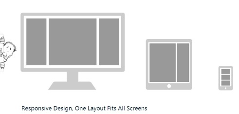
To date, the latest trend in the website industry is the RWD or responsive web design. This innovation is particularly aimed at making websites perfectly viewable on any screen including mobile handsets without continually stretching and zooming its content. Responsive web design values the “quality over quantity” philosophy. Because most mobile users are being limited when they access your site, contents like images are being squeezed to meet the limitation of the handset. By using RWD, images are no longer cropped but instead scaled to to help images load quickly without destroying its resolution.
Luckily, RWD are also being offered in some Philippines web design companies despite being new and having coined the term only last 2010.
 Outsourcing Web Design